How to Utilize an Email Footer to Improve the Customer Experience
Last updated: October 13, 2024

Have you ever been enjoying a nice, meeting-free Friday afternoon when an email lands in your inbox, filled with customer angst about trying to unsubscribe or change an address? You think: Who could I pass this off to? It’s just email! How did they get MY email?? Maybe you’ve been on the other side of this, too – you’ve tried to unsubscribe but keep getting emails until you finally take the time to figure it out.
None of us like to be in either of these situations. We want our customers to be happy, we want our Fridays to be peaceful, and we don’t want to search for unsubscribe buttons when we are on the receiving end of an email promotion. In this post, we’ll offer ideas on how to use an email footer to minimize friction, avoid customers hitting the ‘this is spam’ button and work to improve the overall customer experience.
Set up a standard footer in Email Builder
Within the Omeda platform, you can create a piece of html in the Tools -> Opt-out Settings section of Email Builder. Next, add your html footer content and customize for each of your deployment types. Last, the footer is simply a merge variable you can include in your content or select from the Insert Merge Variable drop-down in the Message Body. Add it to all of your emails, as a safeguard to meeting customers’ needs in a clean and simple format.
What should be included in an email footer
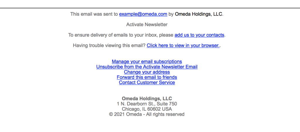
Based on CAN-SPAM requirements, you’ll need to include your company’s physical address plus a way for recipients to opt-out of receiving email from the sending deployment type. The confirm unsubscribe link is a merge variable that can be included in the footer html. It links to an Omeda-hosted unsubscribe form. Some additional items you could add to the footer include: a preference page where customers can manage permissions to all brand deployment types; an email, phone number, or form customers can use to contact customer service; a change of address form (especially relevant post Covid); a forward-to-a-friend link (also a merge variable); instructions on how to add your domain to safe sender list; and a link to the online version merge variable.
Check out the Email Engagement Report for the latest benchmarks & best practices
Email Builder Preference Forms
Did you know you can create a brand-specific preference form in Email Builder? We can help you upload a customized logo, and within Deployment Defaults, you can create a preference page, selecting the deployment types to be included. In the deployment level defaults, select the form and enable it. Next, reference the preference page link merge variable in the footer html. Your audience can use the preference page to opt-out of deployment types they are currently opted in to, opt-in to additional deployment types, or unsubscribe from all deployment types displayed on the form. The Deployment Delivery Report will show number of clicks to the preference form, and include a separate Preference Page Report where you can see which deployment types customers opted-in or out of.
Form Builder Preference Forms
To get more creative with preference forms, you could opt to utilize Form Builder. Some examples of things our clients have done: set up a redirect to the brand’s site upon submit to help convert Anonymous Olytics users to Known; redirect to a survey form in order to request reasons for the unsubscribes if a customer unsubscribes from all; send a confirmation email upon submit as a receipt of updating preferences; offer one additional product before confirming an unsubscribe from all to try to maintain engagement.
Forward to a Friend
The footer can be an opportunity to ask your audience to share your email with their friends. Even before the days of Yelp and social media, we listened to our friends. Take advantage of the power of referrals by referencing the forward to a friend merge variable in your footer. In deployment defaults, you can customize the header, and preview to the form. The Deployment Delivery report will provide a list of your audience members who clicked on the forward to a friend link, which you could also use to further target your highly engaged customers and brand advocates.
Instructions on how to add your domain to a safe sender list
While you may ask new customers to add you to their contacts when they sign up, in a welcome series or confirmation email, the footer can also be a great place to reference these instructions. Sometimes a simple call to action will prompt customers to take a second to ensure they’ll get your email in their inbox. Omeda’s Knowledge Base offers instructions for the top email clients. Maybe you have a similar page that can be helpful to offer the same information to your audience.
How it can all come together
Here’s an example of what a footer might look like:

The customer experience is vital for establishing strong relationships between your audience and brand. Implement an email footer that is appropriate for your audience. Think of it as an extra piece of content that allows them to set preferences and take actions. Give your audience the tools to request more, less, contact you and unsubscribe if necessary. As always, reach out to your client success manager for any guidance and review our knowledge base for additional resources.
Subscribe to our newsletter
Sign up to get our latest articles sent directly to your inbox.