Email Design Best Practices for 2024
Last updated: October 2, 2024

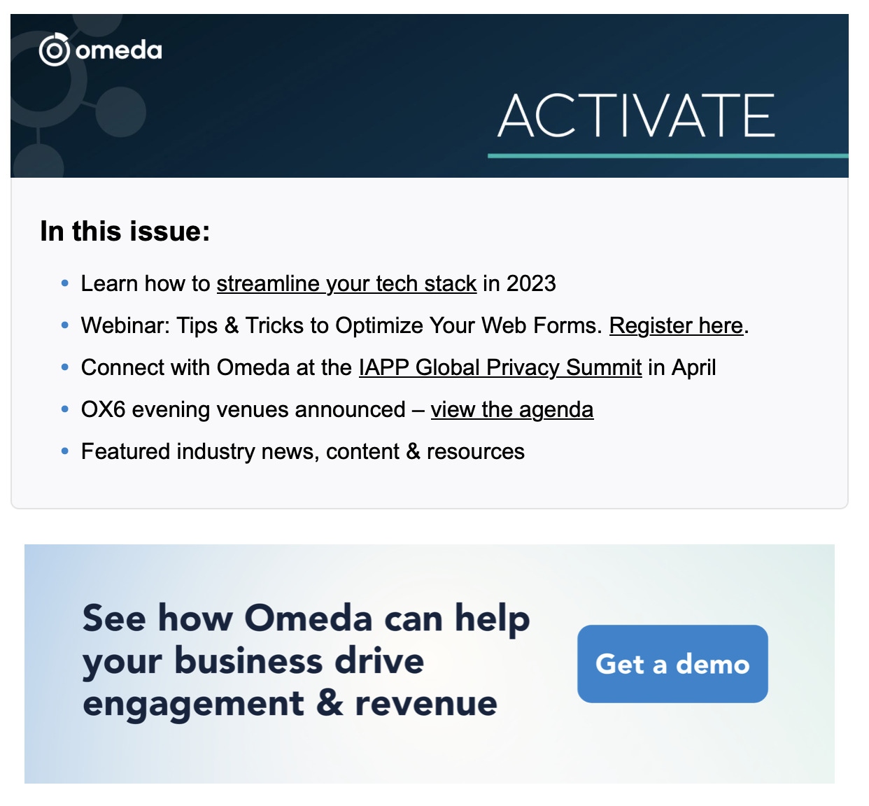
Effective email design makes the difference between earning clicks and getting bounces. With some simple design and copy optimizations, you can make your emails more skimmable and effective — without losing the heart of your message.
Learn how to design more effective emails here:
Email Design Principles to Implement in 2024
1. Emphasize usability
The last few years, we’ve seen hyper-produced emails with a lot of images, copy, etc. With the right design, these can take on a beautiful editorial feel, but they can also prevent recipients from taking the desired action of clicking through or making a purchase.
Check out the Email Engagement Report for the latest benchmarks & best practices
Recently, we’ve seen more companies prioritizing usability over aesthetics in their emails. Streamline your own emails with these tips:
Create descriptive CTAs: People are more likely to respond to specific, strong appeals rather than less deliberate ones. Tell your audience exactly what they can expect by creating stronger calls to action. If you’re encouraging people to download an eBook, you might say “Get your insights now” rather than “check it out.”
Create a clear visual hierarchy: Trying to parse a piece of information from a giant block of text feels like trying to find a needle in a haystack. Your audience needs to spend more time and energy to find the information they need and most likely, they’ll just click out instead.
Instead, split your content into multiple content blocks, each with 2-3 sentences max. Separating your content into manageable chunks allows you to say more to your audience without chasing them away. Alternate between complementary background colors to draw your reader’s eyes from one content block to the next. For instance, if your header has a black background, you might use white for the next one, then switch back to black, etc.

Anticipate secondary follow-up actions that a user might take upon reading the email. If your email is reminding someone to make an overdue payment, most recipients will click through to the website and make a purchase.
But some may think they’ve made the payment already and wish to talk to support instead. In this case, consider including customer support information in the footer of your email. It’s not conspicuous enough to distract your main audience, but it’s available as a resource for those who will need to use it.
Use the right file sizes: Oversized file sizes prevent your images from rendering and hurt your deliverability. We recommend keeping your images under 200KB and your HTML email files under 100KB. Also keep your email as a whole below 102KB so it doesn’t get clipped by Gmail.
Test your emails in dark mode: More and more mobile users are opting for dark mode over the standard light mode, as it puts less strain on the eyes. Up to 81% of email users read their emails on dark mode some or most of the time. So whenever you’re testing an email, check in both dark and light modes.
2. Minimize your designs
The more time you demand from your audience, the less likely they’ll stick around long enough to convert. That’s why we’re seeing a shift toward minimalism both in email copy and design. But if you’re creating a high-priority email for your business, everything might feel too important to cut out. Here’s how to simplify your emails without totally stripping them down:
Keep your copy concise: Given the choice to say more or less, say less. Include the most basic information in your email, add some personality with a phrase or two, then leave it at that.
Make use of negative space: This gives your design room to breathe — and directs your viewers’ focus to the content that matters most.
Use select feature images rather than complex layouts: Complex image-heavy layouts are harder to digest in one glance. Instead, use a single column layout broken up by a few smaller images. Besides being more user-friendly, this also reduces loading times.
Create shorter emails: Instead of creating one sprawling newsletter, consider segmenting your audience into two groups and create a smaller newsletter for each one. Also note that Gmail chops off emails or makes the recipient open them in a separate browser if their file sizes are too large.
3. Use responsive design
The best email is the one that gets read. So if your email isn’t optimized for different device types and sizes, it’s going to fail regardless of how elevated the design and copy is. Make your emails more responsive through the following design fixes:
Use a single column layout: When email isn’t optimized for mobile, it’s usually because the design stretches too wide to be seen on phone screens. Sticking to a single column ensures that mobile readers can see your full email without needing to scroll to the right or left.
Put your most important CTA above the fold: Mobile readers are more likely to read on the go, and less likely to take the time to scroll down as a result. Putting your biggest CTAs “above the fold” (above the point at which readers need to scroll down )makes it easier for mobile readers to quickly get the point of the message, then take the desired action (sign up for an event, click through, etc.).
Make sure your CTA buttons are clickable on mobile: Since phone screens are smaller than devices, it’s harder to click buttons — and convert — on mobile. Test your emails on mobile to ensure that readers can click your emails without needing to zoom in.
Spread out your links: It’s hard enough to click on one link within an email: You need to zoom in, use the very tip of your nail and squint before you get where you need to go. Placing multiple links too close together will make this even more difficult, as recipients might accidentally click the wrong link and eventually give up. Avoid this by placing only one link within each content block of your email.
4. Place CTAs in high-traffic locations
Most emails are written by writers or marketers, who are predisposed to read something until its conclusion before acting on it. However, the average person reading an email between tasks might not read until the end — or read it at all. They might just click the header or the first paragraph to see what’s on the associated website.
To earn conversions from your emails, you need to know what points within your message that your audience is most likely to click first. This might be the header image, header text or even a well-placed CTA within the middle of the page. On Omeda, you can use a heat map to identify where people click most, then adding CTA links in those areas.
Will you put these email design best practices to the test?
Being on trend can’t make up for bad content. But having aesthetically pleasing emails can keep people on page longer than they would have otherwise, and net incremental clicks and click-throughs for your messages. In a hyper-competitive email landscape, that alone can make the difference between earning business or falling flat.
Of course, being “on trend” won’t matter if those trends don’t align with your audience’s needs and preferences. So before implementing any sweeping design changes, we recommend A/B testing your emails or sending them to your most loyal audience first.
Subscribe to our newsletter
Sign up to get our latest articles sent directly to your inbox.
What you should do now
- Schedule a Demo to see how Omeda can help your team.
- Read more Marketing Technology articles in our blog.
- If you know someone who’d enjoy this article, share it with them via Facebook, Twitter, LinkedIn, or email.