4 registration wall examples from leading publishers
Last updated: October 25, 2024

Many publishers are using registration walls to learn more about their audience, create more targeted content and experiences, and build stronger relationships with their readers. But you can’t just slap a reg wall on your home page and hope for the best. Your registration flow — from initial encounter to final confirmation – needs to be clear, cohesive and above all else, match the value you’re providing your audience.
So let’s look to some publishers who are doing it right. Below, we’re looking at four examples of how top publishers are using registration walls to boost their engagement. Whether you’re just starting out or you want to refine your strategy, these examples will offer insights into what’s working and how you can apply similar tactics to your own content.
4 effective registration wall examples from leading publishers
There’s no one right way to run a reg wall. Ultimately, the right design, placement, strategy and format of your registration should depend on your audience preferences, as well as your business model, value proposition and content mix.
Learn tactics to create and sustain a paid subscription model
So instead of spouting generalized best practices at you, we’re going to spotlight a few effective registration walls from leading publishers — then give you ideas to inform your own strategy.
Financial Times – use special interest newsletters to drive website registrations
Typically, you’ll see publishers promote website registrations on their website, then tell readers they can get “exclusive newsletters” once they sign up.
That’s all well and good. But those exclusive newsletters — or other premium content pieces — are generally higher value than your standard news article. So it’s worth using these assets to drive website registrations, rather than the other way around.
That’s what Financial Times is doing. They’re heavily promoting their special US election newsletter on their site, and including website registration as a benefit of subscribing.
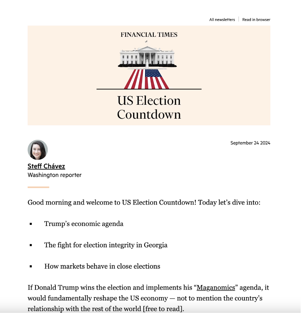
This is a really smart strategy, especially for a “general interest” news publication covering the same breaking news as other business-oriented news publishers. By tying their registration to a differentiated news product covering a specific time-bound topic, FT can draw in readers that otherwise might’ve just read an article or two before leaving.
Then once users are in the flow, they can see some of the benefits of registering for a free account, like viewing the rest of the website, commenting on and sharing articles.
Give readers a sample before subscribing. Another reason this reg wall works: On the landing page, readers can click “view sample” to get a taste of the FT’s coverage before committing (which is especially valuable for a sensitive topic like political coverage).
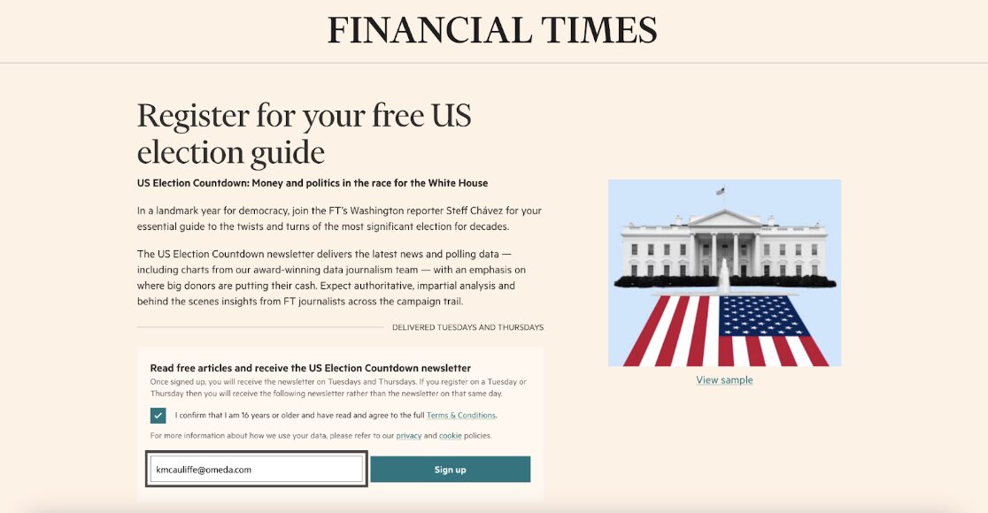
The benefits to the user are obvious, but this also helps the publisher: The “view sample” link also gives the FT team more data they can use to evaluate their conversion funnel. If their reg walls start seeing unexpected drop-off, they can use click data from that “view sample” article to see whether the article itself is turning potential registrants away or whether something about the site’s design/UX is making people bounce.
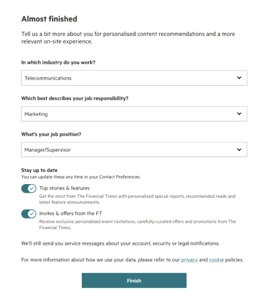
A third page prompts us to answer a few more qualifying questions about our industry, seniority, and job function, all of which they use to tailor content recommendations and UX to our individual needs.
Include whitelisting information in your registration confirmation emails. Upon completing the form, we receive a confirmation page that includes whitelisting information for both Apple and Android devices, along with instructions for all kinds of devices.
Harvard Business Review – use registration walls to qualify and engage their most promising paid subscribers
Harvard Business Review is a leading business publisher with decades of peer-reviewed research covering leadership, organizational culture, and more. Producing trustworthy research outside of a paywalled academic journal means that they appeal to a lot of different audiences, like business leaders and consultants, as well as college students and, say, content writers needing citations.
Only some of the above audiences are likely to pay for an HBR subscription. Having both a reg wall and a paywall allows HBR to create differentiated strategies for their paid and non-paid audiences.
They can use the reg wall to provide access to and run ads against their non-core audience — those college students and freelance writers. Then they can use paywalls to drive revenue from the demographic that’s most likely to pay — business leaders looking for corporate subscriptions.
So how can HBR promote both packages within the same website experience? Here’s how it works: Readers on Harvard Business Review can read two free articles before being blocked by a wall appearing on the lower ribbon of the page.
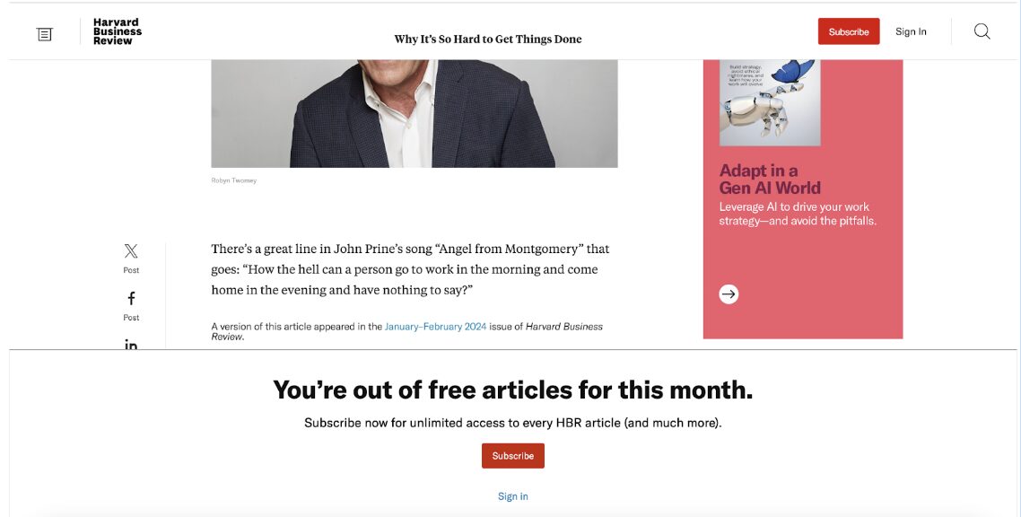
Match your messaging to your value-add. It’s worth noting that at first glance, it’s unclear whether readers can register for a free account or if they need to pay for further access. HBR provides research and analysis that’s hard to find anywhere else for free, so they can probably get away with this level of ambiguity. But you may need to be more clear that your registrations are free, especially if you don’t have any proprietary insights. So use your subscription management provider to A/B test your paywall copy, design and CTA to see what works for you.
Returning to HBR, clicking through the reg wall reveals that readers can sign up for a free or a paid account.
The form only asks us for our name, email and a password. This is generally a good move, especially since HBR can always get more information about their readers via activity they take on their accounts later on.
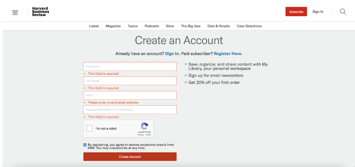
Offer tangible rewards for registering. The page also lists the perks of a registered account alongside a streamlined registration form, including, interestingly, a 20% discount on a future order. That’s useful because offering “access” to content can sometimes feel a little abstract to a potential registrant — if someone doesn’t know how frequently they’ll visit your site, how much value can they really assign to something like “free access to website content”?
So adding a concrete discount on top of that free access adds more perceived value to your registration product, while also driving more traffic to your paid products. If you don’t have paid subscriptions, consider offering free access to any industry reports you produce, free or discounted access to events, or a consulting call.
Reuters – use registration walls to create more curated user experiences
Similar to HBR, Reuters allows readers to access a few free articles before blocking them with a registration wall. However, their language makes it explicitly clear that registration’s free to all users.
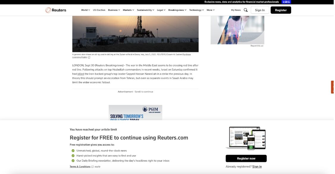
Reuters uses their reg wall to personalize the reader experience and target them for paid subscriptions later on.
Their data-intensive registration flow reflects this: Their process includes a 3-step survey that asks for name and email, followed by demographic information as well as individual topics of interest, along with multiple opt-in boxes for specific topical newsletters.
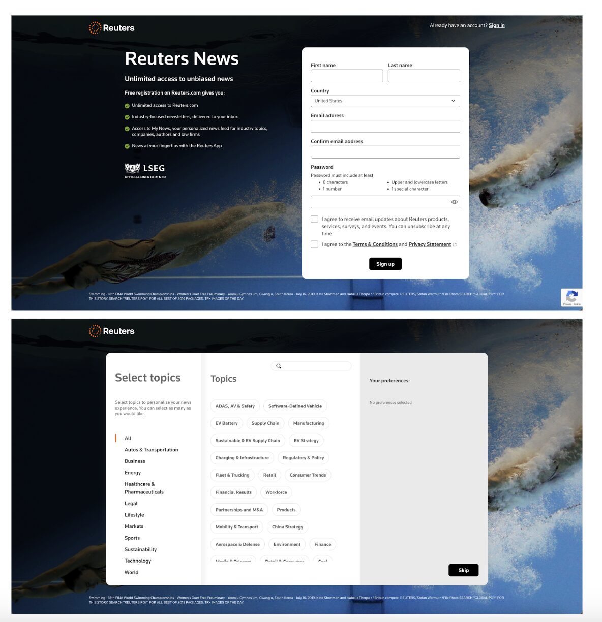
That demands more from the readers. But if Reuters gets the segmentation and execution right, the reader benefits from disclosing that info: As we can see on the second page of their flow, registered users get industry-specific newsletters as well as personalized news feeds covering their preferred industries, companies and authors.
This gives the Reuters team a wealth of information they can use to create hyper-specific welcome series and recommendations for new registrants as soon as they sign up. But it can also backfire, especially if you don’t have the same cache as Reuters.
So as we said before, it’s worth A/B testing your registration walls and surveys before committing to it — or only using this in-depth survey for your most active website readers.
This is possible on Omeda: You can create different paywalls for custom audience segments you build within your Omeda database. So you can create a segment targeting active website visitors that haven’t registered for an account, then trigger the paywall solely to that audience. This way, you can get important qualifying information from people who are likely to enthusiastically provide it, without turning away people that are just discovering your content.
Also make sure you’re using tools that allow you to a) segment attendees based on their responses and b) create campaigns based on those responses, right away. That way, you can start sending customized newsletters or offers to each registered user based on their responses — without waiting to manually build lists or clean your audience data.
That’s where having a CDP that connects to your marketing automation solution really comes in clutch. The CDP takes in those survey responses and records them in each person’s pre-existing audience profile in real time, and puts those people in or out of marketing segments based on their responses.
From there, they can receive ongoing newsletters or offers targeting people in those segments. The new registrant gets resources that are relevant and customized to their needs — and your team doesn’t need to perform hours of busywork to do it. (That kind of precision is possible on Omeda, which combines a CDP with marketing automation and subscription management to provide a complete audience marketing solution.)
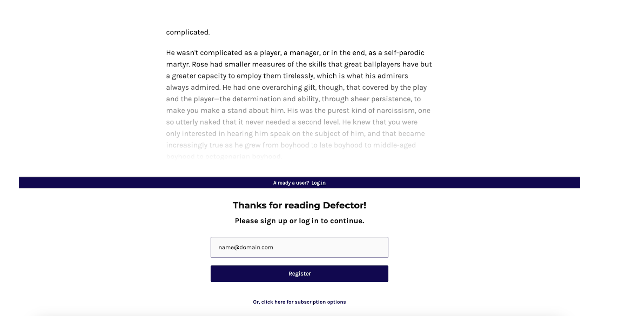
The Defector – align your registration flow with your value proposition and user preferences
The Defector is a new sports media publication founded by former senior staffers from cDeadspin, a sports blog famous for its unfiltered, edgy and uncompromising coverage of sports and sports media. But as a growing publication, they need a way to learn more about their unique audience without blocking access to the content that makes them stand out.
Their registration flow achieves this: Readers of The Defector are prompted to register after reading about two paragraphs of their first free article. This gives the reader enough time to get a feel for The Defector’s particular style, which is especially important for someone whose differentiation comes largely from its voice (see below for some good examples: ESPN’s MLB columnists aren’t calling analysts “clever microphone addicts,” for instance).
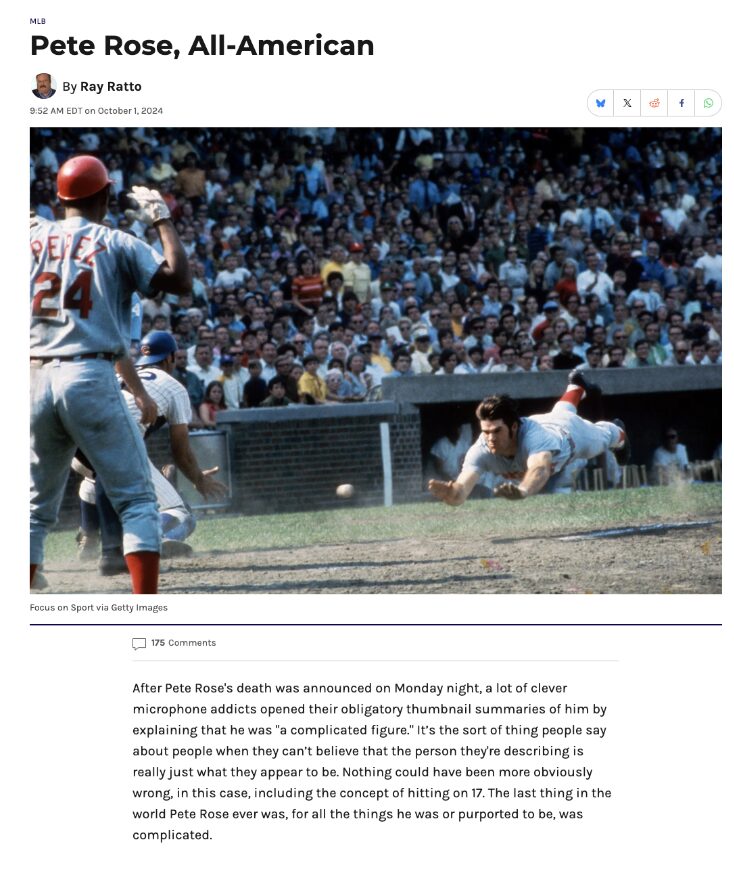
Also worth noting: The reg wall is non-descript in both placement and appearance, appearing along the bottom of the page with a stripped-down navy blue and white design. That minimizes its impact on the user experience and maintains focus on what really matters — the content.
Struggling with siloed subscriber data, complicated workflows, and declining audience engagement? What if you could unify your subscriber data and use it to engage and convert your audience with less effort? Discover how Omeda’s integrated Audience Data Platform helps teams like yours use their subscriber data to strengthen their media businesses.
Subscribe to our newsletter
Sign up to get our latest articles sent directly to your inbox.